Every time I need to draw a forest, I think about how to do it in the best way possible – quickly and beautifully, without hating everything around me. I look at how other artists do it. Some people do a strong stylization, which is cool, but it doesn’t fit what the customer expects from me, and it also requires practice. Some people take a photo of a forest and use the tone and color of different objects to draw their own on top, which gives a great mix and a feeling of a very realistic drawing, but it requires practice so that it doesn’t look unfinished. Some people simply use a lot of brushes for a more painterly forest or brushes – tree shapes. I have tried all these methods in the past. And the last couple of times I told myself – next time make trees in 3D.
I have already made various elements in 3D for my illustrations, mostly they were very rough models or megascans of bushes and grass for the foreground, which I rendered with a transparent background and put in Photoshop.
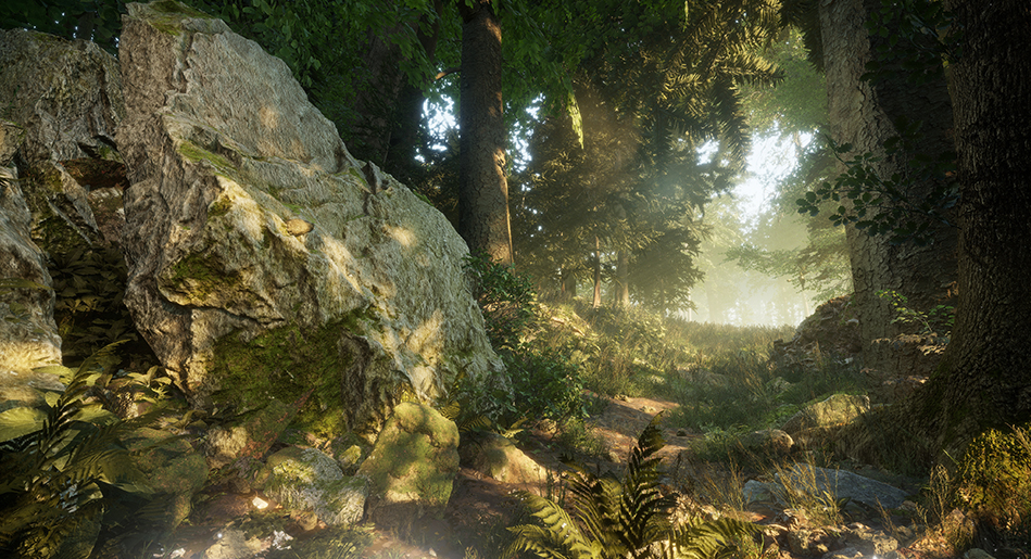
This time I had a very rough sketch from the customer of what they wanted to see in the end, so I decided to make a mini scene in Unreal 5, especially since megascans are now supposedly free there (at least it didn’t ask me for anything), and then find a good angle to draw the character there.
Since I was doing this for the first time, and in general quite rarely, my approach this time was most likely far from optimal. But I will take that into account next time 🙂
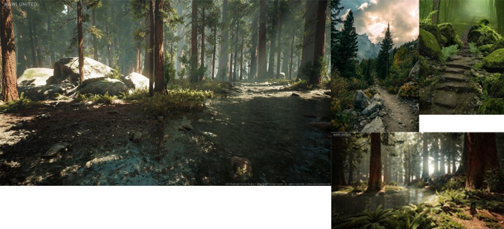
I found a bunch of references to beautifully lit forests, and, oddly enough, after a bunch of more or less boring photos, I googled “unreal forest” and that’s where it was all much “more fun”, even though it’s not very correct. I also found photos of individual elements, such as the road, stones by the road, pieces of rocks, in order to compose a convincing and interesting composition from them.
After the rough composition in Unreal was ready, I started playing with the light and fog, showing different options to the customer. I tried to add more fog so that after I added the character, it would be easier for me to combine the background and the drawn object in terms of detail. I also played with the camera focus, lenses, and bloom. The goal was roughly the same – to find a balance between the presence and absence of details, and to add a bit of magic to the whole background.
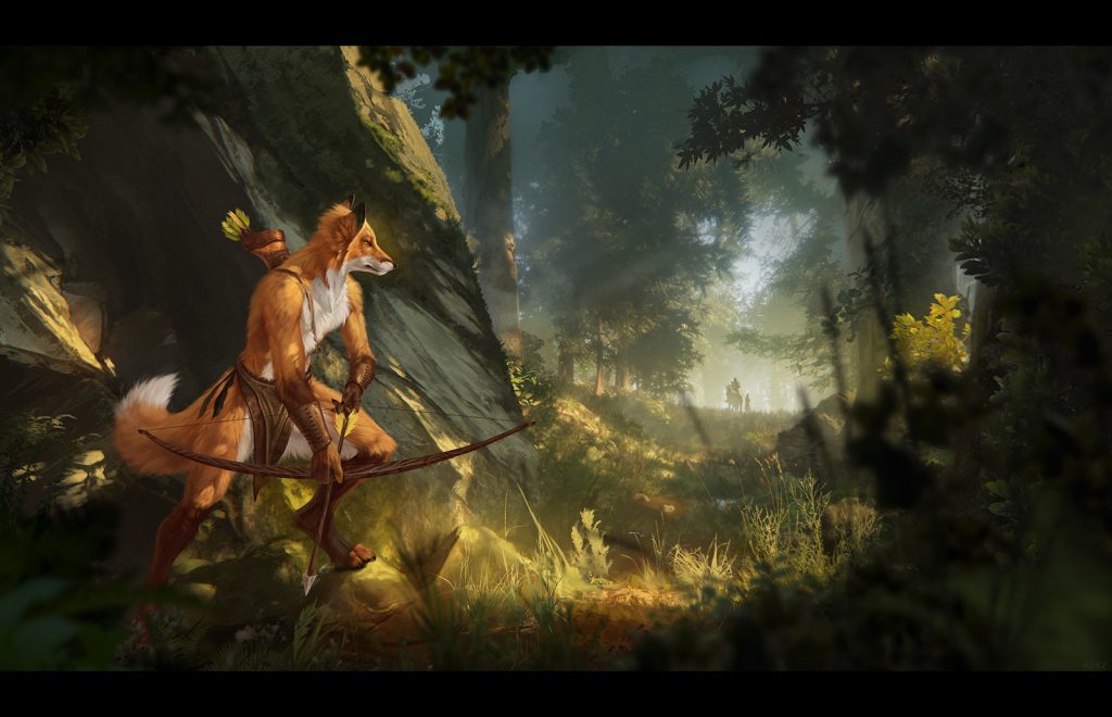
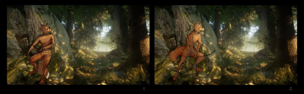
After rendering the background that everyone liked, I sketched out the character and how it would stand in the environment.
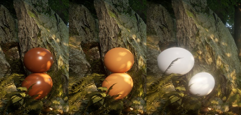
The customer said, “Okay, go ahead.” And then I thought that I was too lazy to try to match the tone and shades in the 3D scene, and I had already seen this approach before. So I created spheres of the colors I needed, to match the color of the future character, and rendered them too, so that I could later simply use the “eyedropper” to take a section corresponding to the angle and position of the section on the character. In theory, then it should be perfectly integrated into the environment, at least in terms of tone.
In the process of drawing, I shaded the area of the rock behind the character to make it stand out more with contrast. This required an unforeseen change in the tone of the rock. It would have been possible to render another sphere and see how the light and tone worked on it, but I decided that it would be faster to do it all by hand.
Later (or in parallel), I started to overpaint the background, especially the part that is closer to the viewer, so that it would not look so artificially 3D. I also wanted to make it more interesting and change it to fit the needs of the specific composition. I added shadows and light between the trees to give the drawing depth. I also added photos of bushes, branches, and leaves to the foreground, with or without overpainting. I overpainted the ones that were not very blurry in the foreground so that they would not stand out.
The character in the background was also added by hand later, although there are also horse models in Unreal.
This whole process could move forward and backward until I decided that the picture looked homogeneous enough and satisfied the customer.